For my two dimensional aspect of this portfolio project, Farren and I were able to create some(mostly) pleasant results, which I have documented below under two headings: “ENVI Imaging” and Other “Imaging”.
ENVI Imaging
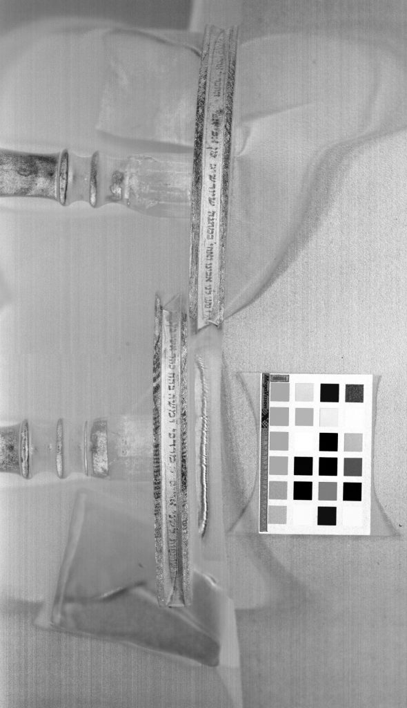
Preliminary Observations: Observing the Torah spindles with the naked eye, there were a few details that “jumped out at us”. The most prominent characteristic was the effaced text in the center of either spindle. This is what we determined was the area that we would have to enhance the “problem area” in order to maximize the legible text.
Step 1 – Flat Field Calibration of the Image Cube: First we selected the “Torah 01” image as our object. For calibration, we created a region of interest (ROI) of the whitest area of the image, indicated by the white squares of the Macbeth color chart standard below the left spindle.
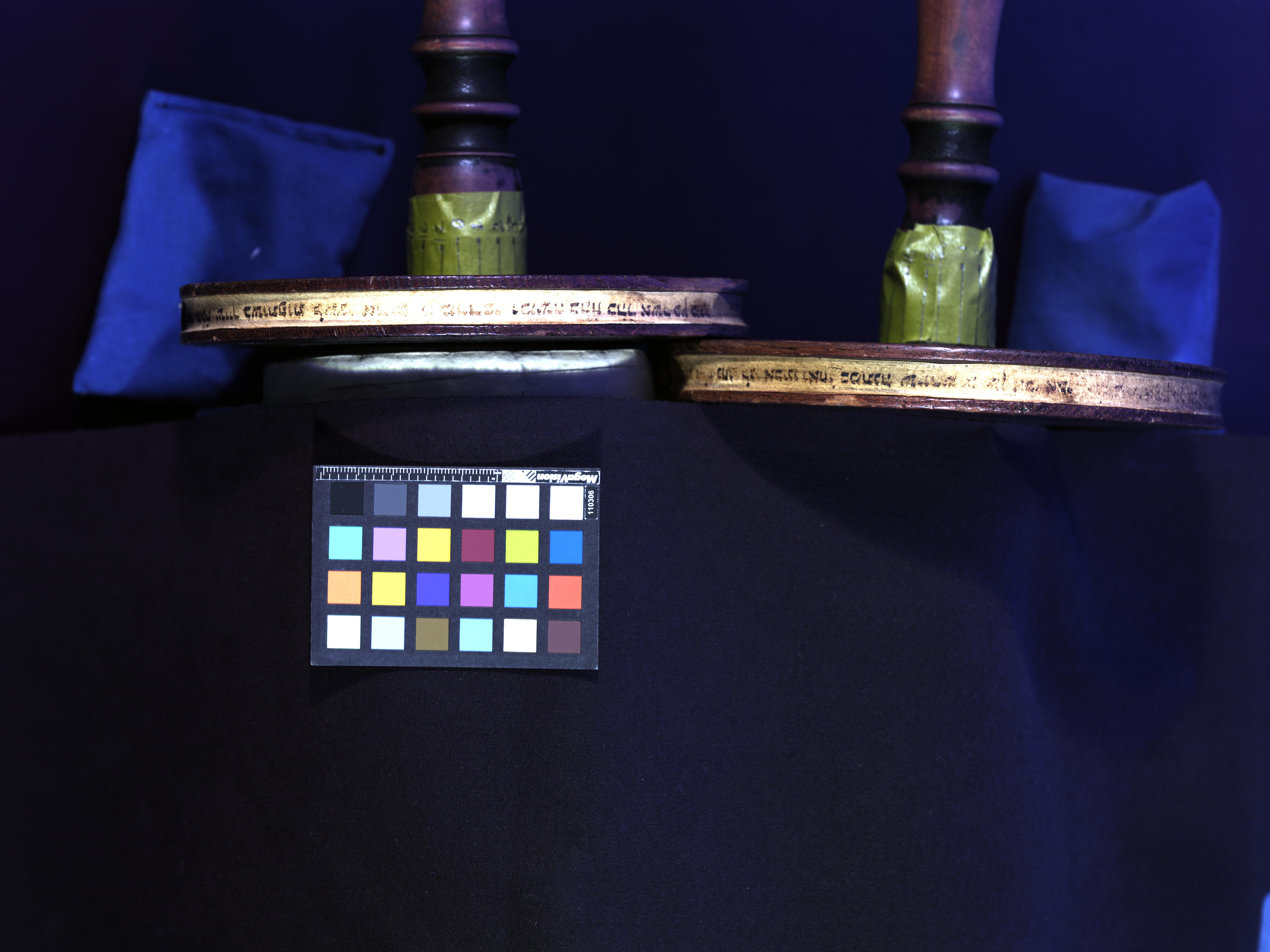
Step 2 – Blur and Divide: For this step we selected a “blur kernel” that was slightly larger than a brushstroke. (For this step we calculated the pixels between either side of the zoomed-in image of a discernible brush stroke.)
It turned out that this was not the most useful step for our purposes. Applying the “blur and divide” function to the Torah image we selected did not bring out details of the “problem area” in the middle of the spindle and it seemed to produce more noise.
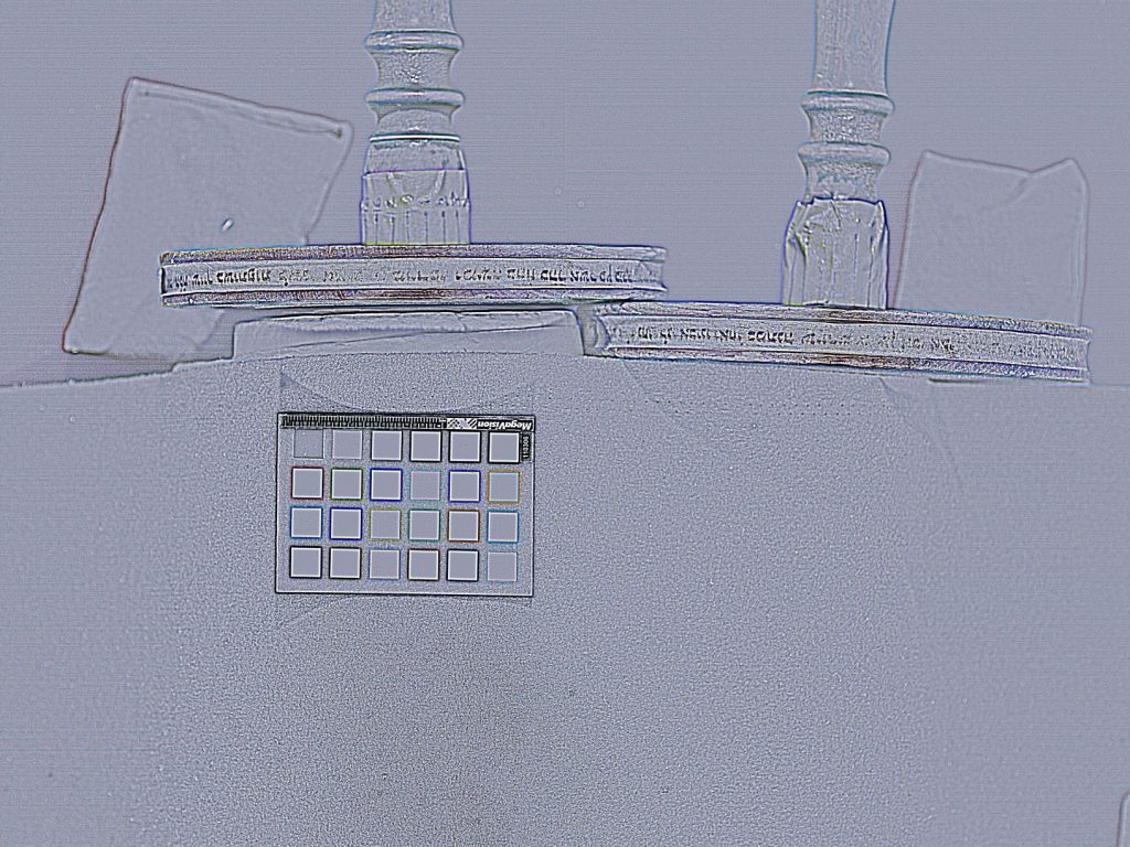
Step 3 – Principal Component Analysis (PCA): The ROI I chose for this step included little of the substrate and focused on the visible ink from the text, which may have resulted in the general illegibility and profusion of noise in the final results. Notwithstanding this possible human error, there were a few bands which revealed the initially effaced text – albeit in only a vague outline. (Specifically, these were bands 3, 4, 8, 9, 10, and 15.) After combining a few of these bands in order to create a composite red, green, and blue image, this was the final result that seemed the most revealing. (below) The bands selected were 15, 10, and 9. (for red, green, and blue, respectively) When we computed from existing stats, the result was virtually identical. (There was actually no way we were able to distinguish the results.)

Step 4 – Independent Component Analysis: For this step, I first revised the ROI to include as more of the substrate and text. In both the “compute new statistics” and “compute from existing statistics” stages of this step, we discovered the bands that produced the most legibility differed somewhat according to whether the left side or right side was less/more legible, (with some degree bit of overlap in legibility.)
Excitingly, we had discovered bands which revealed text that was not visible to the naked eye! I have attempted to document which bands presented the most previously-effaced texts for either spindle below…
ICA – Compute New Statistics: For the wheel on the left side of the image, the optimal bands were 01, 07, 11, 13, 15, and 18. For the wheel on the right side of the image, the optimal bands were 07, 11, 15, 18, and 21. This composite image we created includes bands 18, 15, and 11 (Red, Green, and Blue, respectively)
ICA – Compute from Existing Statistics – These results, we agreed, were better than the “compute new statistics” step, and so we eventually used a combination of these bands to produce our “final” image (before PhotoShop.) Optimal bands for left wheel: 01, 07, 11, 15, 16, and 18. Optimal bands for right wheel: 05, 10, 11, 18, 24. The composite image we created consisted of the bands 11, 18, and 24 (for red, green, and blue, respectively)
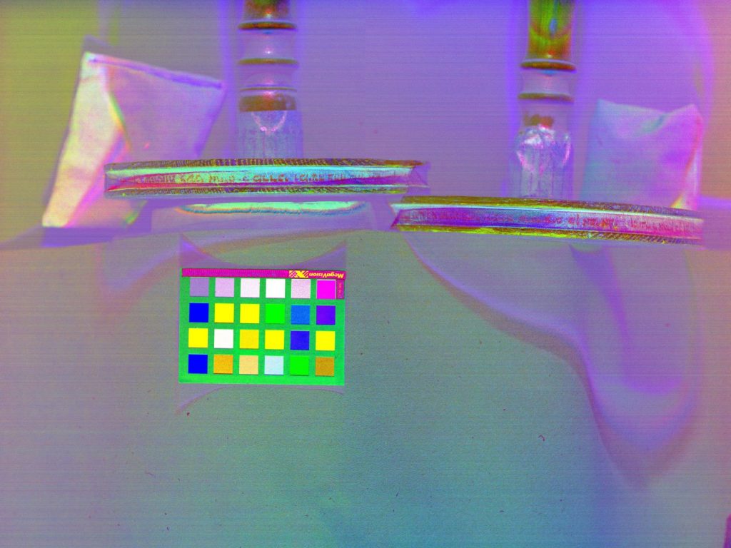
Step 5 – Color Inversion: In order to maximize visibility, we decided to invert the color scheme using the “Control RGB IMAGE PLANES.” This seemed to increase the contrast, so this is the image we exported to Photoshop.
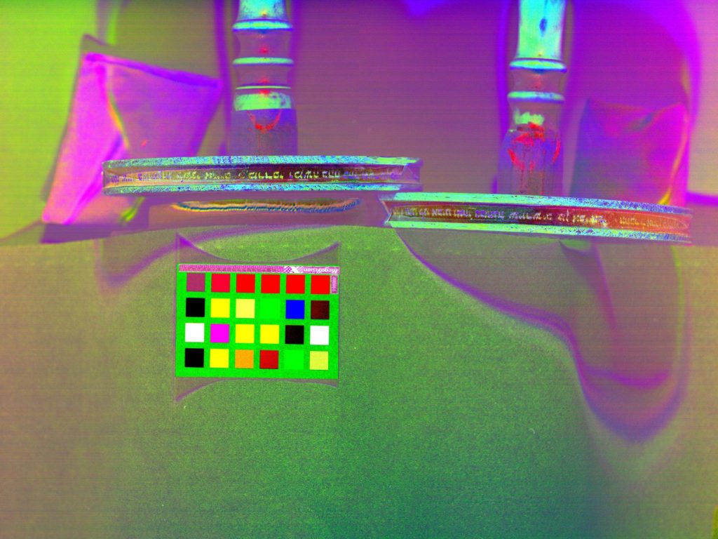
Step 6 – Photoshop and Final Image: Finally, with the image in Adobe PhotoShop, we applied several global changes to it in order to increase contrast, by altering the hue and increasing the darkness/lightness of certain colors. In the Lazarus lab, Dr. Heyworth assisted us in “hue rotation”, resulting in the black-and-white image below:
Other Imaging
Victorine Deed: Farren and I also did some scanning of a peculiar document we encountered in the Robbins Medieval Library. Using my novice understanding of Latin (and Farren’s more advanced understanding, as she is currently taking a Latin course), we were able to conclude that the document was a deed for the transference of property to a certain Monastery of Saint Victor in the year 1217, enacted by the wife of a deceased French landowner and executed by a notary whose insignia appears at the bottom of the main page. (Additionally, vernacular French on the outside of the document and its tripartite folding creases suggest that it may have been a parcel, or created for delivery.)
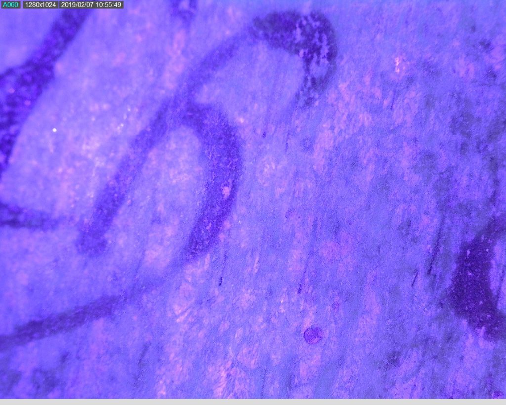
Using the Dino-lite portable microscopic imaging tool, we were able to discern key features of the text, and confirm some hypothesis about the nature of the materials used in its composition.
First, we were able to determine that the substrate was likely sheep vellum, based on the arrangement of the follicles and the general glossy texture of the manuscript.
Secondly, the UV scan brought out the pigment of the text, leading us to conclude that the ink was probably iron gall. Moreover, the infrared images did not capture the ink, (which is also a characteristic of iron gall pigment.)
Both infrared and ultraviolet images of the text are provided below:
UV 
UV 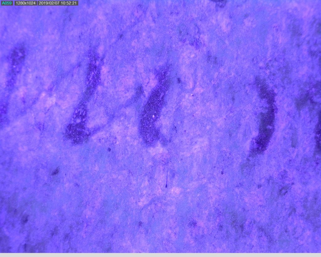
UV 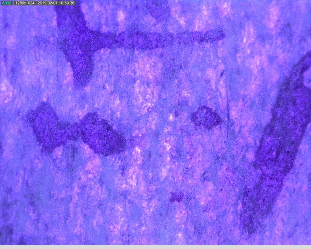
UV 
UV 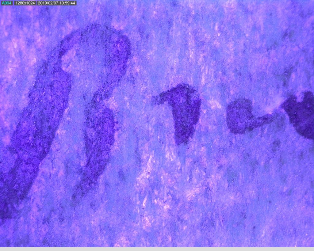
UV 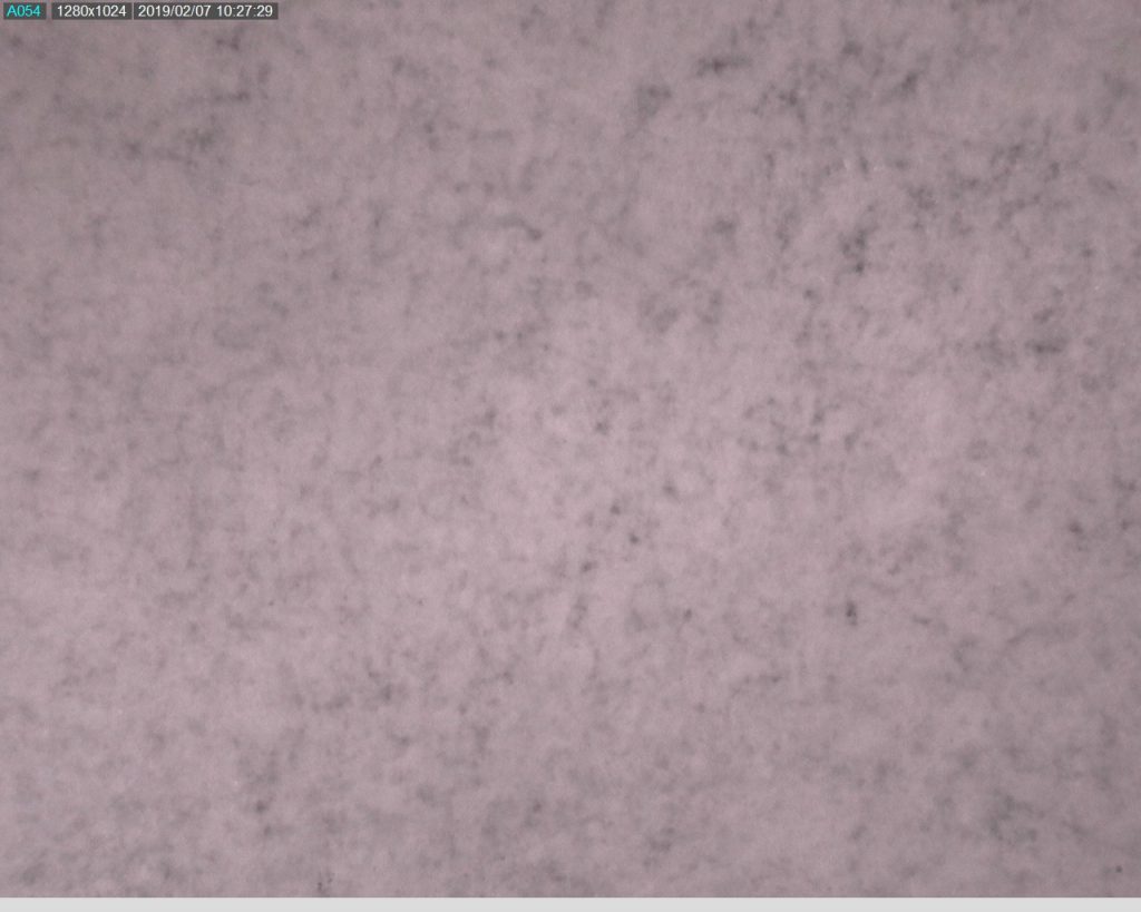
Infrared “text” 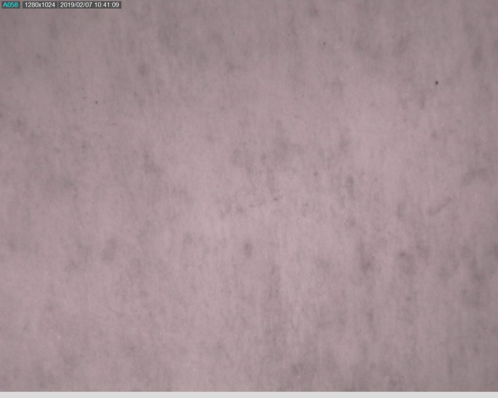
Infrared “text”